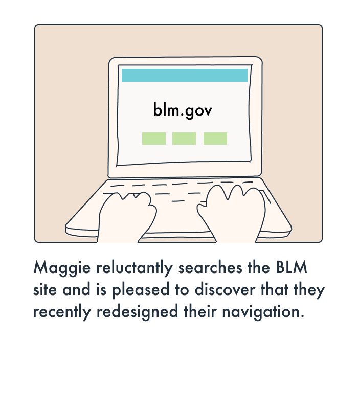
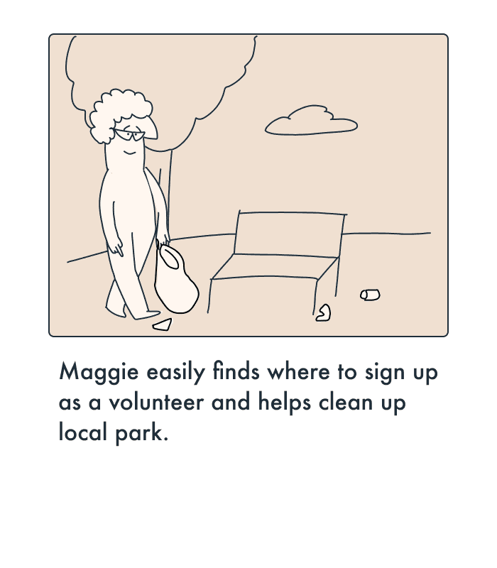
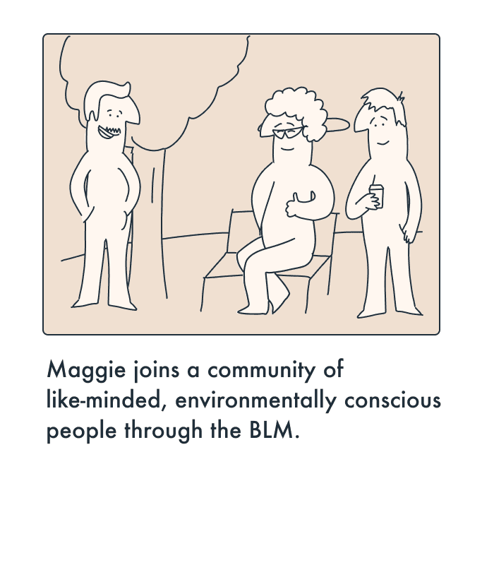
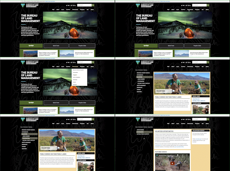
Government websites are notorious for being full of important information that is both difficult to locate and a mundane experience. After an initial assessment, I chose to redesign the navigation and create a responsive user interface for the Bureau of Land Management.
The Bureau of Land Management navigation lacked significant organization. Certain design patterns were unsuccessful and uninviting. Users on their website need intuitive navigation to decrease the amount of time locating their desired endpoint.
In order to give users the best experience when looking for resources, volunteer opportunities or regulations, I developed a more streamline navigation bar and conducted user testing to accurately assess other opportunities for improvement.
Research
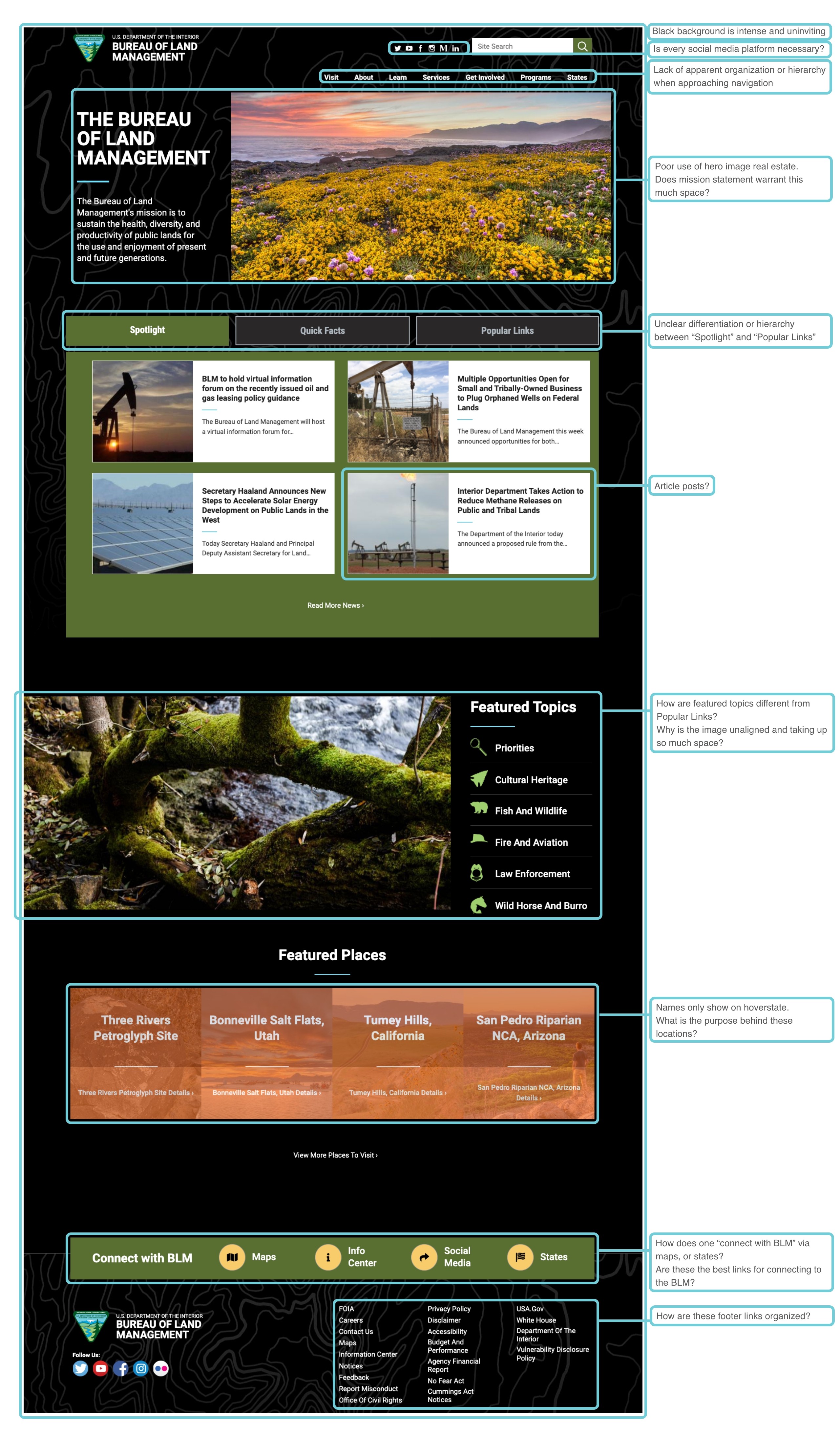
I began assessing the current website and navigation for the BLM. By highlighting key features on the home page, I was able to ask insightful questions and indicate if certain aspects had purpose.
USER PERSONA

MAGGIE SMITH
Demographics
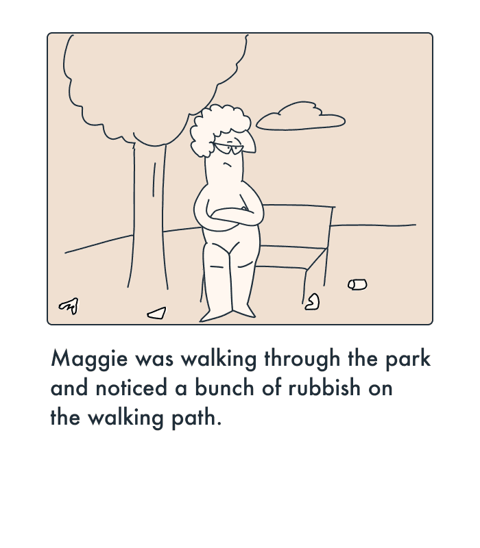
-Female -67 years old Single -Springfield, OR -Elementary teacher
Behaviors
-Has 2 dogs, Kathy-Lee & Hota -Loves hiking -Conservation-minded -Enjoys gardening on the weekends -Democrat -Spends rainy days in the library
Goals/ Needs
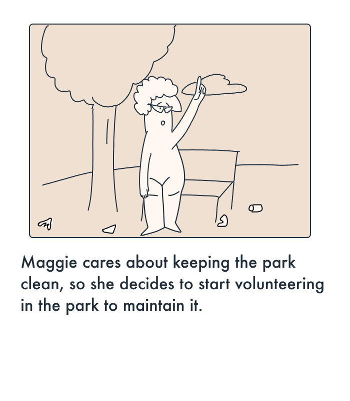
-Volunteer opportunities -Find info about conservation -Connect with like-minded nature enthusiasts
Pain Points
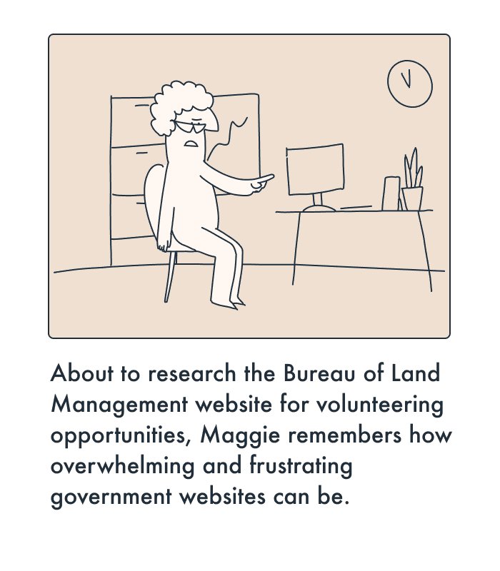
-"Government websites overwhelm me" -"How do I find reliable info on climate change?" -Staying connected with public programs
Cardsorting
After the user testing was complete, I started to analyze and reorganize the structure of navigational components.
The original navigation lacked any apparent organization of the listed components. I sorted the components into cards and from a higher scope was able to group similar components. The following includes the components and the theme used to group them together.
"Interact" -By grouping BLM programs, users can easily engage with the BLM in one location.
"Services" -This included links to safety authorities like fire, law enforcement and public safety.
"States" -before the states, were not organized. I determined to group them into buckets by their geographical region.
"Resources" - This gathered any links to documents, forms, data, or any collection of files needed by the user.
UI DESIGN
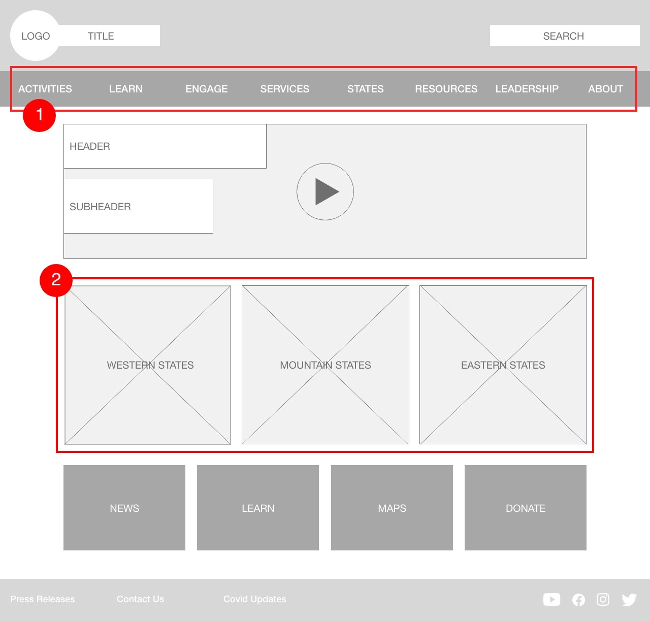
From the card sorting I created some low fidelity wireframes to restructure the BLM homepage and the site navigation. I returned to some testing in order to determine which homepage layout was more comfortable and intuitive for users. The responses informed the design that gave more breathing room in the navigation bar as well as on the homepage.
Inconsistent spacing in navigation bar.
Links to states by region take up too much room.
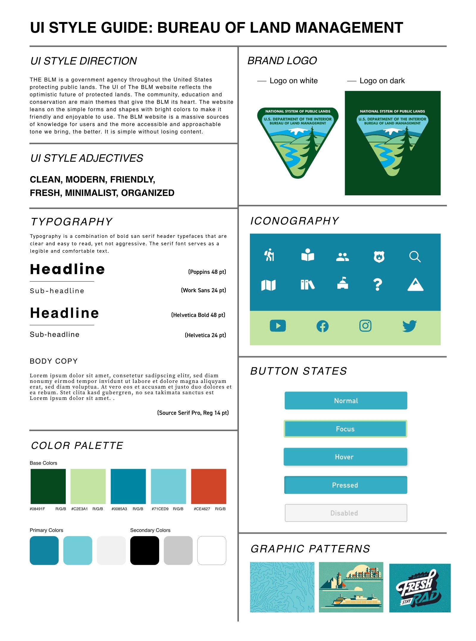
After iterating on initial wireframes for the homepage, I implemented my style guide. The style guide was a culmination of type, colors, shapes, logos and images that would inspire the visual look of the website.
Prototype
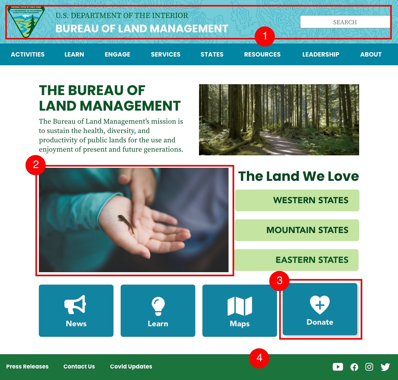
My first implementation of the homepage was generally successful, but I got some helpful feedback that informed my next round.
1. "The topographic pattern over your header bar is distracting and makes the header title difficult to read"
"Hero image could be more 'land' themed"
"The icon on the donate card makes me feel like I'm donating blood. Am I donating blood or money?"
"Footer bar color seems disconnected"
Final Redesign
As the world resumes traveling post-pandemic, finding unique, healthy dining options has become more difficult. Locavore is a mobile application for helping those who desire or need healthier options on the road.
Next Steps
As the world resumes traveling post-pandemic, finding unique, healthy dining options has become more difficult. Locavore is a mobile application for helping those who desire or need healthier options on the road.

